The Evolution of Our Kitchen – The Ongoing Saga
Let me start with saying I am so happy to be back in the groove again! Life has been busy and making the choice to quiet it so I can start doing the things I enjoy again (like blogging) was long over due!
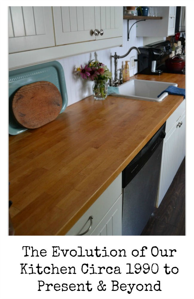
Ever since I had the opportunity to read Love The Home You Have by Melissa Michaels I have had a major shift in my attitude towards my home.
And lately my thoughts have been all about our kitchen.
I thought I would share with you the evolution of our kitchen from the time we purchased our little cottage home in 1990 up to how it looks today.
While I once was completely content with function, I know realize emotion plays a really big roll in the design of our kitchen as well.
And since I have been so ready to make some changes I thought I would share a bit of my vision, and welcome some feedback on what you might do if this space was your own!
Lets start at the beginning.
Circa 1990
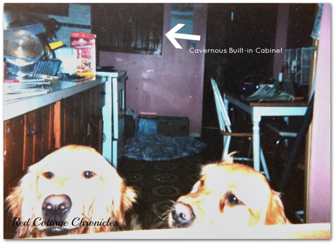
The kitchen was an eat-in kitchen with a short counter running down one side and kind of a built in cupboard in the end wall that used space inside the wall. It was extremely deep and everything always got shoved to the back and forgotten about!
The table sat opposite the cabinets, under the window!
Behind that peachy/pink wall on the right of the photo is the refrigerator, which opened up towards the table.
And, that floor. Just ugh! But, the ugly floor made no difference in how the kitchen functioned.
Even the dogs wanted out!
It was functional enough, albeit lacking a bit of practical storage.
Circa 1996
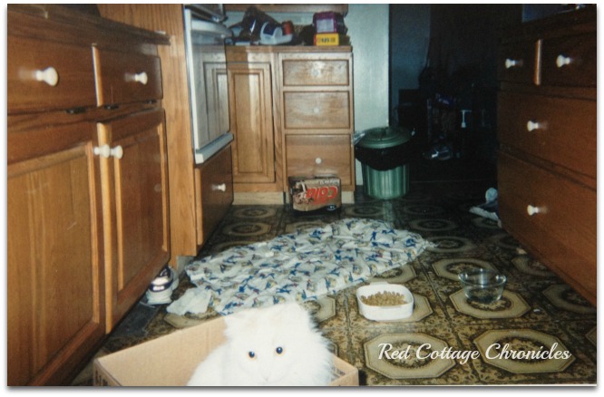
My boss was renovating his kitchen (which, by the way, my entire house could fit in!) and he offered us some of his old cabinets.
Again, completely functional but not my choice. I was greatful for his offer and it added much needed storage. The girls were growing and I seemed to “need” more stuff to get things done in the kitchen.
These new-to-us cabinets did allow us to close up the big cavernous cupboard in the wall and create an L-shaped lay-out!
It included a cabinet for a wall oven, so we upgraded our old stove. On the right we utilized the cooktop cabinet as we were able to relocate the table to the newly created dining room.
Although this picture doesn’t show it, there were also uppers along the left side.
Still, the floor remained unchanged and even the cat would rather sit in a box than sit on that floor!
Circa 2002-2015
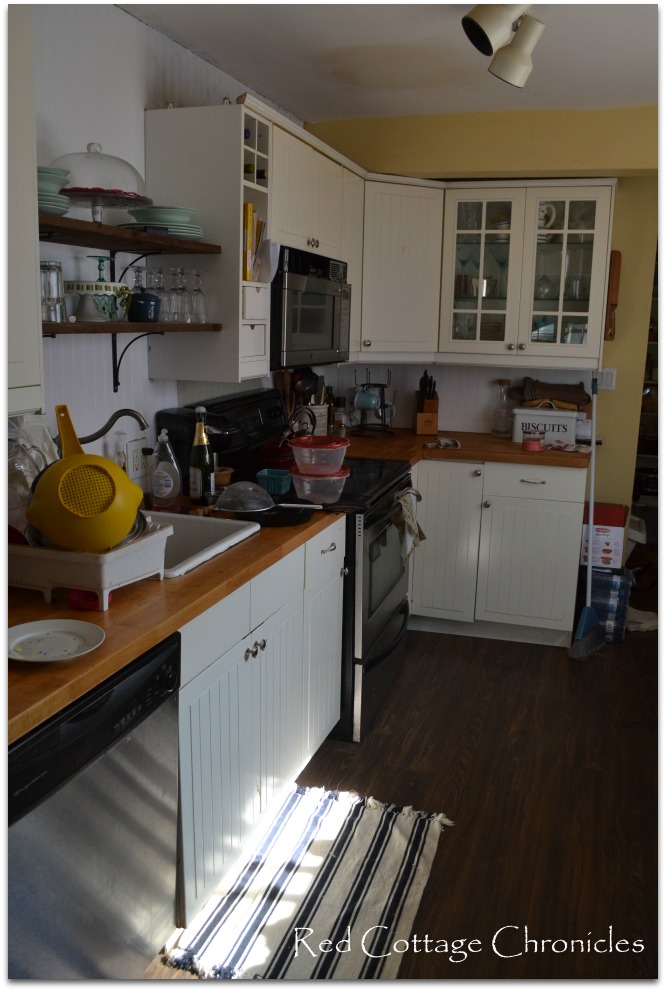
I was really happy when finally were able to do a larger scale reno and update with new cabinets of my choosing, as well as new appliances including a dishwasher! And a new laminate floor. Oh happy day!
Sadly, the dishes still do not do themselves! It never ceases to amaze me that I am the only one who knows how to work the dishwasher door. At least I assume the rest of my family can’t do it since they leave all their dishes on the counter for me to load in!
You’ll notice a beam running above the cabinets at the end of the kitchen. This cannot be eliminated without some major engineering as it is a load bearing wall that used to be the exterior wall. The home owners prior to us had added the basement, elongating the kitchen about a foot in the process.
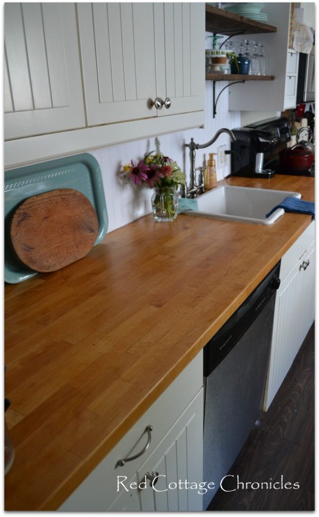
It was with this remodel that I really started to consider the emotional feel of the kitchen when considering the design. After all, I spent a lot of time in there and wanted a bright and happy feel.
We choose the Stat cabinet fronts from Ikea, and while I still love the style, I am not impressed with the finish which is peeling off some of the lower cabinets and yellowing on the uppers (and this is a non-smoking home)!
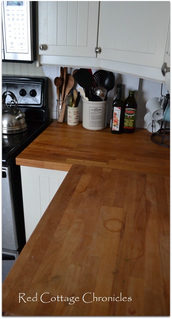
It didn’t take me long to realize I really disliked the wall oven and counter cooktop layout that came with the hand-me-down kitchen, and was happy to see that go.
We have open cabinets with a solid butcher block on the window side of the kitchen now. This is my main prep counter, as I much prefer facing the outdoors instead of a wall!
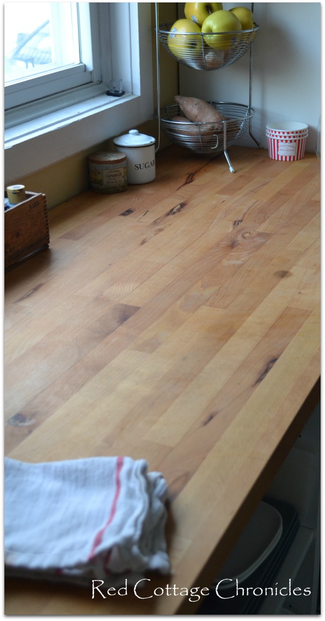
As there is no doubt this is our forever home, I am finding emotion is playing an even bigger roll in the design.
I have the functionality all figured out already. I know what works and what doesn’t.
I have a few ideas on how I want things to evolve…..
- remove microwave/fan hood from above the stove, and all the cabinets beyond that, right around the ‘L’ (thus exposing the cavernous open cupboard we covered up-but read on for my plan for that space!)
- opening up the cavernous cupboard, but building in shelving that is only about 12″ deep, like this ..

- (Source) from the movie “It’s Complicated”
- installing the glass upper cabinet to opposite side of kitchen beside window (maybe)
- remove the doors on the upper cabinets to the left of the sink (not entirely sure about this though)
- Strip the thermofoil finish off lowers with a heat gun and paint the lowers in a shade of gray/green

- install a “curtain” on lower shelves in cabinet on the right side of the kitchen that currently is open shelving. Dogs + open lower shelving = washing dishes BEFORE using them
- paint the kitchen walls a shade of white
- Install new exhaust fan
- Install drawer style microwave in open lower cabinet on the right side of kitchen
- Changing sink to either an undermount or a stainless or white farmhouse style (opinions please?)
I have also toyed with the idea of painting the butcher block on the sink side of the kitchen to resemble soap stone like the one here. Although I think that is freaking my husband out a bit! I mean it is solid wood, I can always sand it down. Right?!
Long term plans include updating the range to a Wolff gas range and updating the refrigerator, but that will have to wait as what we have now is current, clean and working just fine.
So, what do you think? What would you change if this kitchen were yours?
Until next time…
Maureen







I am guilty of watching that movie for the same reason!! That, and her amazing bakery!
Im in the same spot with wanting to update my kitchen. It’s not a 90’s kitchen but it’s still 12 years old and outdated. I never “really” liked the look of my kitchen so when I change it up it will be a drastic change. I think the choices you suggested are awesome. I do love the look of your counter but yeah I’d probably go with the darker top. However you change it, I’m looking forward to seeing your “after” pics & post! Good luck!
It was so hard to have patience while I waited to save enough to do the kitchen I finally wanted! I have a small piece of countertop left over, so I am going to “test” the chalkboard finish on that first and see how it looks.
Wow! This post is so, so timely for me. We live in a 70’s ranch-style home and I’ve worked hard for 13 years to make it a cozy cottage (on a DIY budget). Lots of painting and a picket fence have made me happy!! But our kitchen is in NEED of some major work. I’ve pinned and pinned photos but so far they’ve been nothing more than a dream. Your kitchen makeover is perfect! Just my style and within reach of my budget I think. I will definitely bookmark this page for inspiration and future reference. I’ll also be subscribing to your beautiful blog. Glad I found you!!
I am so happy I can provide some inspiration! IKEA cabinets are relatively inexpensive, and I think they have done away with the thermoforming! All things considered we have been pleased with them.